Coding Compendium
A free 100-page ebook collecting my projects and tutorials for Raspberry Pi, micro:bit, Scratch and Python. Simply join my newsletter to download it.
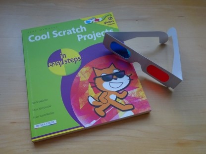
I've always been fascinated with 3D effects, as you might have gathered if you've read my explanation of how stereograms work. More recently, my book Cool Scratch Projects in Easy Steps included a pair of 3D anaglyph glasses and three projects you can create using them.
For a while, I've been wondering how to create an anaglyph website using just CSS. For me, the important aspects were:
If you're not familiar with the term anaglyph, it means the 3D effect you get using red/cyan or red/green glasses.
When reading about the CSS text-shadow shadow in Dan Cederholm's excellent book Handcrafted CSS, it occured to me that this could be exactly what I need...
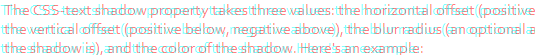
The CSS-text shadow property takes three values: the horizontal offset (positive to the right, negative to the left), the vertical offset (positive below, negative above), the blur radius (an optional addition that specifies how blurred the shadow is), and the color of the shadow. Here's an example:
h1 {
text-shadow: -2px -2px 0 red
}
And this is what it might look like (represented as an image):

You probably use hexadecimal colours, like #ffffff for white and #000000 for black. There is another way to express colours called rgb which uses a number from 0 to 255 (in decimal) to represent each of red, green and blue. The rgba way of expressing colours goes a step further, and includes a figure for transparency (from 0 to 1). So you could express a 50% transparent red, for example as:
rgba enables some nice effects, such as having a semi-transparent background with foreground text that remains 100% opaque. Internet Explorer introduced support for rgba in IE9, and it's supported in Firefox 3+, Safari 3+ and Opera.
For the anaglyph effect, the importance of rgba is that it enables text to overlap semi-transparently.
It doesn't matter whether you're using red/cyan or red/green glasses. You can use the cyan color for the right eye, which is #00ffff or rgb(0,255,255). The left eye is red, #ff0000 or rgb(255,0,0).
Here is how to use text-shadow to make a simple anaglyph effect...
p
{
color:rgba(0,255,255,0.5);
text-shadow: rgba(255,0,0,0.5) 4px 0px 0px;
}
It works like this:
Here's what it looks like (represented as an image for incompatible browsers)
As they say on the telly, put on your glasses now! You should see that text sink away from the screen.
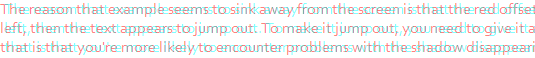
The reason that example seems to sink away from the screen is that the red offset is to the right. If you make it to the left, then the text appears to jump out. To make it jump out, you need to give it a negative offset. The problem with that is that you're more likely to encounter problems with the shadow disappearing out of the left hand side of your content box. Make sure your content box has enough padding to keep the shadow within it. Here's an example, using an offset of -4:
p
{
color:rgba(0,255,255,0.5);
text-shadow: rgba(255,0,0,0.5) -4px 0px 0px;
padding-left:4px;
}
Here's that 3D anaglyph paragraph (represented as an image for incompatible browsers):
The amazing thing about this effect is that the mouse pointer appears to go behind the text when it rolls over pop-out text like this. Try it!
You can change the distance that the text appears to sink into or pop out of the screen by changing the horizontal offset on the text-shadow. You need to express this offset in pixels: using em would result in the offset changing as the text size increases, which isn't what you want. From my own experiments, I think 24 pixels is the maximum comfortable offset, but it seems to take longer to focus the eyes the greater the offset, and at higher offsets the eyes can be confused about whether the image sinks or pops out. It's particularly confusing if there isn't much white space around the content. I recommend using settings of -8, -4, 4, and 8.
One natural extension of the idea is to make links appear to pop out of the screen when the mouse hovers over them. This isn't too hard to do: you just change the CSS hover state so that the text-shadow has a smaller value for the horizontal offset, changing it from +4 to -4 for example.
The problem is that because the text shadow moves to the left and the eye perceives the position of the item to be mid-way between the red and cyan images, the text appears to jump to the left. To correct that, you need to add additional padding to the left of the link in its hover state. When I change the shadow's horizontal offset from +4px to -4, adding a padding of 8px corrects that jump.
.poplink, .poplink:visited
{
color:rgba(0,255,255,0.5);
text-shadow: rgba(255,0,0,0.5) 4px 0px 0px;
padding-left:4px;
padding-right:4px;
}

.poplink:hover
{
color:rgba(0,255,255,0.5);
text-shadow: rgba(255,0,0,0.5) -4px 0px 0px;
background:none;
padding-left:8px;
}
To apply the effect to your links, you just need to give them a class of poplink, like this:
<A class="poplink" HREF="index.htm">Home</A>
The effect takes a moment to perceive, so it can slow down the use of links.
If you are using a compatible browser, you can try that effect out using the links below:
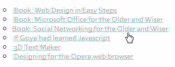
If you don't have a compatible browser, here's a screengrab showing the Social Networking book link selected and apparently in front of the others (obsolete links have been removed above but not in the screengrab below):
Here's some example page content showing it in action. It only works if you have a compatible browser, which generally means a recent browser version that isn't Internet Explorer...
Paragraph pops out of the screen slightly. This enables you to have an additional layer of depth because the borders, pictures and other page elements that have not been explicitly made 3D will appear to be behind it.
Paragraph pops out of the screen slightly. This enables you to have an additional layer of depth because the borders, pictures and other page elements that have not been explicitly made 3D will appear to be behind it.
Paragraph pops out of the screen slightly. This enables you to have an additional layer of depth because the borders, pictures and other page elements that have not been explicitly made 3D will appear to be behind it.
© Sean McManus. All rights reserved.
Visit www.sean.co.uk for free chapters from Sean's coding books (including Mission Python, Scratch Programming in Easy Steps and Coder Academy) and more!
A free 100-page ebook collecting my projects and tutorials for Raspberry Pi, micro:bit, Scratch and Python. Simply join my newsletter to download it.
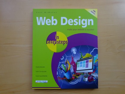
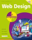
Web Design in Easy Steps, now in its 7th Edition, shows you how to make effective websites that work on any device.

Power up your Microsoft Excel skills with this powerful pocket-sized book of tips that will save you time and help you learn more from your spreadsheets.
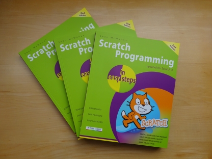
This book, now fully updated for Scratch 3, will take you from the basics of the Scratch language into the depths of its more advanced features. A great way to start programming.
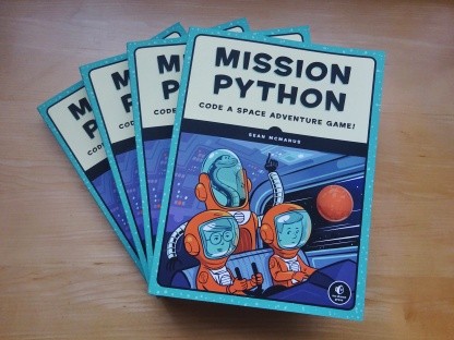
Code a space adventure game in this Python programming book published by No Starch Press.

Discover how to make 3D games, create mazes, build a drum machine, make a game with cartoon animals and more!
 Top | Search | Help | Privacy | Access Keys | Contact me
Home |
Newsletter |
Blog |
Copywriting Services |
Books |
Free book chapters |
Articles |
Music |
Photos |
Games |
Shop |
About