Coding Compendium
A free 100-page ebook collecting my projects and tutorials for Raspberry Pi, micro:bit, Scratch and Python. Simply join my newsletter to download it.
November 2002
Jakob Nielsen is well-known as a usability expert. In this interview by I conducted in November 2002, we discuss the importance of accessibility, the cost of implementing accessible website designs and the impact of Flash's new accessibility features. By Sean McManus.

Press photo of Jakob Nielsen
Why does accessibility matter?
The most personal argument is that we will all one day be in that situation where you need it. There's a continuum from people who have very severe impairments to people with very minor impairments and when you get up into your 40s you start getting into that category of minor impairments. I'm already in a situation where websites with fixed font sizes are getting harder to read for me. When people get into their 50s it becomes a real problem. Not just the font size but several other issues as well.
Beyond that, we already have a large and growing number of users with serious disabilities and a large number of elderly users and those with minor impairments. They're big user populations and yet they've been very neglected in most web designs.
The entire issue of usability is to do with the concept of 'the other' - of other people being different from us. We have to overcome the barrier that people outside the company know less about our products than we do. We have to describe them in ways that make sense to the customer not to people in the company.
Similarly we have to take into account that some of these people may be elderly, or blind, or visually impaired or motor skill impaired or hearing impaired or have whatever other issues - whereas most website designers are not. There might be a few, but they are rare exceptions. Most of them are fairly young people with perfect vision and great mental reasoning skills: they are able to map out in their head where everything is so they are able to understand where everything is that they are looking for on their own website. There's a whole range of issues like that. We hear about all these people outside the company who get lost on the website and can't use it and companies should want to have those as their customers. They shouldn't just go for the young and the able-bodied: they should expand their customer base to include everybody.
That is when you talk about companies: it's just a pure argument that you will get more customers. Then you can become more specialised around that, so you can talk about government websites for example and put it in the form of a political argument and ask what percentage of the population it is reasonable to cut away from government services. The usual answer is very few. Furthermore, who are the people who use a lot of government services? They tend to be among the elderly and those with disabilities so there might be more than the average number of people with accessibility issues that need these services.
There's another issue which we haven't talked about that much but it came up on a project we recently did on intranets. We studied American Airlines' intranet and they have 25,000 retired users. Retired doesn't always mean elderly, but usually it does. So even for intranet design - not customer-facing design - there are still issues.
There are businesses that will seek to justify a return on investment and there is a perception that engineering for accessibility is expensive.
It is admittedly one more thing to do but I don't think it's very expensive if you do it in the beginning. This is the advice we always give for all usability activities: if you have a bad design you've got to change it. That's expensive. If you don't have a design and you just plan it to move in the right direction from the beginning, that planning is not very expensive and doing it right versus doing it wrong is about the same amount of work. It really is a matter of when do you do that planning. Because accessibility has been very neglected, the average case is where it's retrofitted so the average case is where they spent a lot of money doing it wrong and now they're spending another bunch of money correcting the mistakes they made. If you don't make the mistakes in the first place, the expenses are dramatically lower. It is nevertheless a good point.
One of the things we've done recently is tried to work on lowering that cost even more. We have a software tool called Lift. The entire point there is that as you're developing a website, it will prompt you at the vital spot where you make a mistake. You could always choose to ignore it, but you won't develop 10,000 pages all with this mistake without knowing about it.
I think that's also important because many companies aren't in a position to conduct the kind of usability tests that your organisation does. Do you think software like this is a good substitute for that type of testing?
Substitute might be the wrong word but it helps you avoid a large number of mistakes that are already known about. I don't think usability testing is really a very expensive cumbersome process but on the other hand when there are issues that are already known about there is no need to do a test to find them out for the 100th time. You might as well just fix it by having some software that looks over your shoulder and analyses what you do.
The downside is that the software can't do a perfect job because usability always relates to the human experience. Since the software doesn't have artificial intelligence, it can't actually know what you're doing. It can look at the code, it can look at the way the page appears but it can't look at what you're saying - the content is very important. If it's described in a cumbersome way, that will impact everybody. Particularly if it's all read aloud with a screen reader: it's a slower process to skip over a bad paragraph. We're linearising the user interface so instead of being two dimensional, it becomes one dimensional. Webdesign is all about making choices about where they will go at each step. It's much more difficult when it's linearised, so it becomes much more important that it's very clear what the choices are. You don't want to have to rewind to hear them again.
I want to emphasise that there is a great difference between technical accessibility and the ability for users with disabilities to use a website easily. Technical accessibility only means that it's possible for them to get in. Of course, this is a necessary condition for usability, but it's nowhere near sufficient. As proof, just consider the problems that users without any disabilities have using many regular websites. These sites are "accessible" for these users in the sense that they can see everything. That doesn't mean that the design makes sense or that people can find their way around. Exactly the same considerations apply for users with disabilities. We have to design for ease of use, not just for formal compliance with legal requirements.
In your tests did you find that users with assistive technology had developed their own shortcuts or workarounds to get around some of the problems?
Yes, because they have a conception of how most websites work. They have an expectation of how a webpage behaves. A lot of them have a big amount of junk at the top, so they'd tend to skip over that. That's actually quite like sighted people who would not look at the banners for example.
One of the simplest strategies is to say just read me all the links, so I can see what I can do on this page. Which leads to one of the oldest most famous guidelines which is don't make the link text say 'click here'. The screenreader reads 'click here, click here, click here'. Click here to do what? That's what's important. That's what should be underlined or should be read aloud if you ask about the links.
All users have shortcuts. It's so ponderous and slow to progress through websites, you just can't deal with everything they're throwing at you. This is one of the greatest mistakes of webdesigners. They believe that users will read everything and look at all the pictures. People have incredibly selective attention, they just pick out a few things. That's true no matter whether you use a standard browser or whether you use assistive devices. It's the same basic idea.
I think a lot has been said about the accessibility of websites on the assumption that you're talking about a news site or an information site. What happens when you come to web applications like an ecommerce site or banking sites?
In many ways much of it is the same. You know we did a report on Flash accessibility. A lot of it concerns the same issues about things not being clearly labelled. It's just more important when it's the actions that aren't clearly labelled. You might argue that in purely information sites where all you're doing is navigating and moving around, you can try something out and you will discover at the other end whether it's what you want or not. But in an application where there are real features, you don't want to activate the wrong feature because backing out of it is typically quite complicated. If it's a badly done application you might not be able to undo at all. If it's a good application you'll be able to undo but you still have to find how to undo and it becomes again more complicated if it's a bad design. So you really want to be more assured before you issue a command that it's the command you want.
We had a few cases where people were stumped because new features appeared on other parts of the screen that were not visible to them or from new pop-ups that appeared and they wouldn't know that there were these multiple windows going on. Actually multiple windows is hard even for sighted users. Most average people are not really great at manipulating multiple windows but it's particularly bad for the low vision and blind users because the low vision user can only see a small part of the screen so they won't know that other things are popping up. The blind user because they use a linear user interface, they get read whatever window they're in and not the other ones. So they don't have that multitasking type of view.
Simplicity is one of my old guidelines. When you simplify the application and concentrate on the core features and eliminate or at least hide the secondary features that helps everybody learn. It also helps the people using assistive technologies to not get all this clutter and all these secondary things to interfere with access to the primary features. I know it's an old cliché, but it's a true cliché: if you try to improve accessibility you often also improve usability for everyone. There's a lot to be said for that.
I suppose the problem as well is that users with assistive devices have to form a mental map of the website.
Actually everyone does, but it's harder to do it if you can't see it or if you can only see a small snippet. You have to do the mental modelling at multiple levels: at the page level, and at the site level of the application. What are the features? What can I do here?
We know this is hard for everybody. Even for sighted people it's invisible because you only see the one page. We're talking about the same principle which we know causes big problems and we're accelerating it. While the sighted user sees one page or one screen out of a thousand or however many are on the website, a low vision user sees an eighth or one sixteenth of the page and has to understand the rest of the page based on that.
A blind user gets familiarised and has to understand how the things work together. They still have the other problem of understanding the entire workflow, all the features that are available. You're just overburdening their mental apparatus with all this thinking to keep track of. That's really the biggest problem.
That's why I'm advocating a usability approach to accessibility as opposed to a technical approach to accessibility, which I also admit is necessary. There's an entire range of technical problems such as if information can't be read allowed or dealt with on a screenreader or you can't use the keyboard and tab key. But it's just not sufficient to solve these because what we really want to do is to help these users actually use the application and use the website to accomplish their goals. That's the purpose of this entire exercise. It is not to have people sit and go over the same thing many many times and never get anywhere. So usability becomes very important there and you have to really work on this mental complexity and drive that down. That's something that really will help everybody.
It's interesting that for the benefit of those with assistive devices it's important to be more and more simple, for those using a traditional screen it's important to focus on the most important issues and not let junk get in the way. But there are expectations of the visual layout and the aesthetics of the site which have prompted some major organisations to abandon universal design in favour of having a separate accessible version of the website. What are your feelings about this?
I think if they can do it well it's a good idea. That's just a big if. In most cases organisations don't even have the resources to do one design well so that's the key point. If you are big enough or invest enough in this to have the resource to do two good designs, I think that ultimately it's the better solution. Because we can work as much as we want on improving the accessibility of a single design but it's never going to be as good as if we made that the only goal: to make a site that is purely optimised for speech rendering for example, or purely optimised for small screens such as used in the low vision scenario or a site that is purely optimised for keyboard control with no mouse. Those designs would be better, but we're already talking about making three extra designs so it's not just one extra design. So I don't think it's a realistic scenario for most organisations that they could do that. I also don't think that we very often see that they truly do usability work. Usually what they'll do is they'll make a text-only version which solves the technical accessibility problem. A text-only version can be fed through a screenreader and it can be magnified to any font size but it doesn't solve all the other problems of helping people develop a good mental model and reducing the complexity and so on so you really have to work on that as well.
Given that, the development in making flash accessible is welcome since a lot of designers are already committed to using flash on their websites.
Exactly. That's coming back to the more realistic scenario where they're only going to do one design so they need to make that design accessible and so that is why this is encouraging.
How far does the flash accessibility go down the line of accessibility and usability?
The initial stages are just technical ones: they open up hooks for assistive technologies to get at the inside of the flash applications. Now it all depends on what is inside. In our early studies [of Flash websites before the accessibility features were introduced] we found that there was not a lot inside: the coding had all been done with a focus on the visual appearance of these applications. There was not a lot of internal logic. The tab order was completely randomised for example, which didn't at all encourage people or help people to build up an understanding of the features and a lot of buttons didn't have a label that explained what they did. There were a very large number of cases like that. I do hope that this is because it's so recent that Flash became accessible that no Flash designers have had to deal with this in the past and so therefore of course they didn't structure their applications with this in mind. It would have been a wasted effort because nothing would have been able to get at it. Now they can get it at it, they have to put it in. We already have some guidelines to help them do it.
Did you test a flash design that had been optimised for accessibility to see how usable that was?
Not yet. That's what we will do in the next round. We're testing the early round of Flash applications which was hard enough by the way. Because even that required finding where Flash was being used for useful design, not annoying design. We found 46 - we found more but we didn't test every last thing we found - out of thousands of useless flash designs but that is growing. That is a new trend over the last several months. We're not so interested in a demo case - that's not going to be realistic. We're more looking at what the average company is doing and how we can help them improve. We try to assess a broad selection of what companies do on the internet.
It's interesting that you say previously Flash was annoying and now we're seeing some useful applications being developed. I think in the past you've been perceived to be very anti-Flash.
Right.
Do you feel more positively about flash now and is this related to the development in the marketplace of the technology?
It really is and I would say that in principle I was never anti-Flash, I was just anti-annoying design. But since the two were so closely aligned the difference was very small. Macromedia really had a strategic change in the focus of the technology plus they had some practical changes as well such as adding accessibility features, adding support for the back button which is crucial for user interfaces, adding standardised user interface components so that a scrollbar looks like a scrollbar which came out to be a really big thing in our studies. All these steps are 100% in the right direction.
What really matters now is what companies around the world actually do and so the initial outcome is quite encouraging. We have seen several applications. They're not perfect yet. There is no perfect user interface. It's not surprising that the first generation of Flash applications would have some issues. It's just our job to find those and help companies develop the second generation. The second generation's not going to be perfect either, neither will the10th generation or the 50th generation because you never reach perfection in your business. All you can do is make it even easier, even smoother, even faster to accomplish things. You'll never reach perfection.
More on accessibility
© Sean McManus. All rights reserved.
Visit www.sean.co.uk for free chapters from Sean's coding books (including Mission Python, Scratch Programming in Easy Steps and Coder Academy) and more!
A free 100-page ebook collecting my projects and tutorials for Raspberry Pi, micro:bit, Scratch and Python. Simply join my newsletter to download it.
Web Design in Easy Steps, now in its 7th Edition, shows you how to make effective websites that work on any device.
Power up your Microsoft Excel skills with this powerful pocket-sized book of tips that will save you time and help you learn more from your spreadsheets.
This book, now fully updated for Scratch 3, will take you from the basics of the Scratch language into the depths of its more advanced features. A great way to start programming.
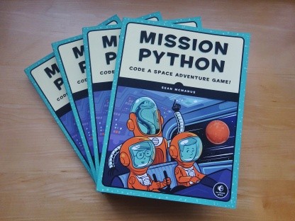
Code a space adventure game in this Python programming book published by No Starch Press.
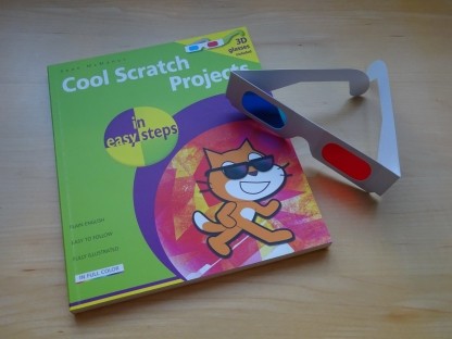
Discover how to make 3D games, create mazes, build a drum machine, make a game with cartoon animals and more!
![]() Top | Search | Help | Privacy | Access Keys | Contact me
Top | Search | Help | Privacy | Access Keys | Contact me
Home |
Newsletter |
Blog |
Copywriting Services |
Books |
Free book chapters |
Articles |
Music |
Photos |
Games |
Shop |
About