
This blog has moved
07 March 2010
This blog is now located at http://news.sean.co.uk/.
You will be automatically redirected in 30 seconds, or you may click here.
For feed subscribers, please update your feed subscriptions to
http://news.sean.co.uk/feeds/posts/default.
The Sun and Daily Mail hoaxed by ghostly iPhone app
05 March 2010
Here's a photo I took at Gloucester Cathedral last year:
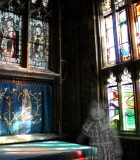
Or have I tampered with the picture?
The answer to that should be obvious, but both The Sun and the Daily Mail were hoodwinked by a similar picture. If you're quick you can read the full Daily Mail article here, and The Sun's story is here. The photo is credited to Hull News & Picture, which says it does "editorial digital photography".
The photographer John Fores is a builder, and took his photo at a school he was demolishing. He claimed that he took photos to record the demolition work, but that the apparent ghost of a boy in a flat cap in one image made "the hairs on the back of [his] neck stick up". He said: "I didn't believe in ghosts, but since I got this picture, I am not so sure."
Fores has clearly been deceptive here: The Mail says that he insists he has not edited the photo, which means they asked him and he denied it. The Sun's picture of him on the building site with his mobile phone shows him with a beaten up old camera phone, and not the iPhone he used to create the image. Derren Brown would be proud of such an artful misdirection.
But surely the press should use more common sense than that? Just because a member of the public says they have a picture of a ghost, that doesn't mean it's true. Even if the story were included as a bit of fluff, its tone could be different. The Sun opens with "A builder demolishing an old school discovered this eerie image of a young boy in a mobile phone picture taken of the site", which effectively endorses the builder's story. The Daily Mail said: "The ghostly image of a young boy was captured on camera as builders demolished an old school building. John Fores, 47, insists the spectral figure was not present when he took the picture..." To use the picture as some light entertainment and keep their credibility, the papers could have taken a more sceptical angle, or even softened their reporting by saying the photographer claims he took the photo normally, rather than just reporting that he did. (There's a guide to handling of uncorroborated statements in the context of press releases, here).
One reason this reflects badly on the newspapers is that many of their readers know exactly how the pictures were taken. Although a lot of people immediately suspected Photoshop had been used, it took just three hours for someone to comment on the Daily Mail that the shot was created using an iPhone app. That app is called Ghost Capture, which costs 59p and enables you to add ghosts to your pictures. It can also be used on the iPod Touch to edit photos loaded on the device. I used the free lite version to make the picture above.
At the time of writing, neither newspaper has corrected their story to make clear that it's fake, which sends a strong signal that they don't care about accuracy or truth. Next time you read a story in those papers, ask yourself whether you are being lied to.
Labels: apps, humour, iPhone, iPod, journalism, photography
Thinking time is never wasted
22 February 2010
We all have writing projects that don't get off the ground from time to time. Sometimes it's because we fail to convince editors to commission them. Other times, it's because more exciting projects crowd them out and there isn't time to pursue them.
There was a nice quote from Stephen Fry on a BBC News story about Fry tweeting again (is that news? - that's a discussion for another day, perhaps). Fry was in discussions to write an episode of Dr Who for David Tennant, but it never happened. "The window passed, and I never really got round to it," said Fry. "But I'm very happy to have had the experience of thinking about it."
I had a couple of projects which didn't take off recently, but that's my view of them too. It's a shame they didn't happen, but it wasn't wasted time. I did enjoy the experience of thinking about them. In my case, I got as far as drafting something. But unless I'm reading that draft, what remains is the way I felt about those ideas and the places they transported me to.
Thinking is not writing (as I've said before), but it is part of the process. Often, it's the hardest part of the process. Even though the projects I was working on failed, they excited my imagination and fused together new paths in my brain. Thinking time is never wasted.
Labels: writing
Vote now for the oddest book title of the year
12 February 2010
Voting is open now for The Bookseller's annual Diagram Prize for the Oddest Book Title of the Year. Thanks to Twitter, this year saw the number of suggested titles triple, although self-published works were excluded.
Prize coordinator Horace Bent told The Bookseller: "The adage that everyone has a book in them may well be true, but that doesn't mean every Tom, Dick and Harry out there can bash a few words out on a keyboard and then upload it to Scribd with a humorous title like: The Historic Adventures of the Purple Waffle Iron on His Horse Made of Asparagus, and then think they have a chance at winning my prestigious award. I refuse to ackowledge such submissions."
This year's longlist ranged from the intentionally funny (such as children's book "Father Christmas Needs a Wee", of which my nephew is a fan, and bestseller "Pride and Prejudice and Zombies"), through the highly specialist ("Baptist Autographs in the John Rylands University Library of Manchester 1741-1845", "Dental Management of Sleep Disorders"), to the totally perplexing ("I'm Not Hanging Noodles on Your Ears", "The Great Dog Bottom Swap", "Venus Does Adonis While Apollo Shags a Tree").
You can help Horace to whittle the longlist down to a shortlist by casting your vote now. Even after that survey closes, you should be able to read the full longlist for the awards here.
Labels: books, publishing, social networking
Two thoughts on The London Weekly
05 February 2010
A new freesheet has launched called The London Weekly. On Twitter, it's getting a serious kicking at the moment. People are criticising its amateurish layout, and its inability to spell the name of Phil Tufnell in a front-page headline.
From the photos I've seen, it looks very much like a student newspaper. The design is boxy, it uses centred and multicoloured headlines, and leaves a lot of distracting dead space. I haven't seen a clear enough photo (or a real copy) to read the body text.
But, here are two observations:
- Firstly, if you're going to criticise a publication for having typos in it, be very sure your critique does not include typos itself. I've read two blog posts on the subject of The London Weekly, and they both include errors at least as bad as those they are damning The London Weekly for.
- Secondly, shouldn't we celebrate the daring of this venture? A relatively inexperienced team has gone into a mature market with a new publication. At the end of the day, they were able to say that they actually launched a new newspaper. Okay, so maybe they'll look back on it in future and wish they had the experience or funding to do a better job of it. But, what did you launch today?
Labels: business, design, proofreading, publishing, writing
Microsoft Office 2010: what's in it for writers?
02 February 2010
I've been playing with the beta version of Microsoft Office 2010. I'm a big fan of Office 2007 - it made a few enemies by ditching a user interface with over ten years of history behind it. But it does make most activities much quicker to carry out, once you've worked out where they are hiding on the new toolbar.
Office 2010 has a lot of crossover with Office 2007. Lots of people were infuriated by the removal of the File menu in Office 2007 and even more so by the help which told you "IMPORTANT: you can't get it back" (paraphrasing only slightly). Well, Office 2010 has introduced a File tab, which takes you to the backstage area. This is basically about the file settings, and the other stuff that goes on in the background and doesn't affect your document's content or appearance. All the features that used to be behind the Office button in Office 2007 are now found here, and the office button itself has gone. This provides quicker access to a lot of features and saves time hunting between different sub menus to find them.
There are a few new features which might save some time. There's a cool feature for inserting a screengrab into your document. You just select which of the currently running programs you'd like to grab (it must not be minimised), and the image is inserted in your document. For those writing software tutorials, this could save quite a lot of time, although this workflow won't help out with book production much because publishers typically need the images to be separated out.
Word 2010 has a new navigation panel down the left, which adds search to the thumbnails and document map, and makes it easier to switch between them. There are some new text effects too, and a web-based translator built in to the Review tab.
The main new addition to Office 2010 is integration with Skydrive, which enables documents to be stored online so that they can be accessed and edited online and from other machines. This is a response to the rise of Google Documents and other online editing services.
I expect additional new features will come to light as I use Office 2010 more, but for now it seems to be more of an evolution than a revolution. Perhaps just having a File tab where the File menu used to be will be enough to encourage people to give it a go. They'll be pleased they did: the old version of Office hadn't changed very much since 1995, and was designed for much smaller screens than we typically have today. Office 2007 and 2010 more fully exploit the available screenspace to enable you to write more intuitively and quickly.
Labels: Microsoft Office, software, writing
Do we need a punctuation mark for sarcasm?
29 January 2010
According to the Telegraph, a company has made thousands of dollars selling software and fonts to express sarcasm. The so-called SarcMark is a spiral with a dot in the middle, and is supposed to be used like a smiley to tell people when you're being sarcastic.
This is a great little ruse, and full credit to the company for actually shipping their idea. We've all had situations where people haven't understood we're being sarcastic, even in person. And if you want to join in the joke, it's probably worth $2 for the bragging rights.
But this misses a key point: if people can't understand you're being sarcastic, the fix is not to put a squiggle on the end to tell them. There is a saying that using an exclamation mark is like laughing at your own joke, and the SarcMark must surely be even worse. The solution is to make your words work harder: intensify the language you use. When people can't tell you're being sarcastic, your sarcasm isn't good enough. If you know there's a potential source of confusion in your words, rewrite them. Punctuation is not a 'get out of jail free' card.
Labels: humour, punctuation, sarcasm, software, writing
Amazon offers Penguin book deal in novel writing competition
28 January 2010
Strictly speaking, it's less of a "novel writing competition", and more of a "novel written competition", given the timescales, but Amazon's new promotion is a fantastic opportunity, all the same. One lucky author is going to walk away with a Penguin book deal and an advance of $15,000 (over £9,000).
There are just two categories: general fiction and young adult fiction. Up to 5,000 novels will be accepted into each category. Eligible works are between 50,000 and 150,000 words. Both unpublished and self-published works can be submitted (although works under contract anywhere else are excluded, obviously). The closing date is 7 February 2010, but if you're serious about entering, you should do so as soon as possible. I think there's a good chance this competition will be oversubscribed.
With that many books to try to process, most of them will be entirely unread. Books will be evaluated first on the basis of a 300 word overview, and then in later rounds on the basis of an excerpt. The overview isn't a synopsis: it needs to sell the book's concept and themes, and so is more of a cover letter. Some might think it's unfair that only 300 of their 100,000 words are being read, but this is a microcosm of the entire publishing industry. It's no good having your best bits buried on page 37. Publishers Weekly will review 500 full manuscripts, and Penguin will read 100 of those.
Ultimately, Amazon customers will select the winning novel from a shortlist of six. This is a good way to ensure there is a market for the resulting novel (a bit like Pop Idol on the tellybox), but it does also tend to skew the results towards mainstream works. A romantic comedy is likely to win out over a political satire, purely on the basis of market demand. But the satire might have been the better book, and the better publishing decision if the publisher has ideals beyond market share.
As always with competitions like this, you need to check the small print extremely carefully. By entering this, you're effectively agreeing to Penguin's contract terms and royalty rates unseen, although I think you retain the right to walk away.
To find out more and start preparing your entry, visit the Amazon Breakthrough Novel Award microsite.
Labels: publishing, writing
Should writers study for an MA?
21 January 2010
Andrew Motion has come out in support of creating writing courses, according to a story in The Times. He said: "People who had no qualms about RADA, or the Royal Ballet School, or the Royal Academy, were wont to say that writing couldn't be taught ... and implied that this sort of tutoring was a form of cheating, like taking steroids if you were an athlete."
His quote is in the context of prize-winning authors. The Times expresses concern that publishers might go fishing for writers on creative writing courses instead of seeking out talent in the wider writing community.
On the one hand, perhaps it's reasonable to expect authors to make an investment in their future and to take their profession seriously. If you want to talk to major publishers about your novel, you need to have a good answer for why they should talk to you. How do you stand out among the thousands of people trying to get their attention? Many of these are wasting their time, so how do you prove you're not? Having an MA shows a level of commitment to your craft that goes above and beyond what most people have invested.
There is a risk, though, that publishing becomes increasingly elitist. It can cost over £7,000 to study for an MA in creative writing, which effectively excludes that option for most writers. And while an MA might show that you've applied yourself to the study, it's no indication of the initial talent you're building on, or the consistency or originality of your ideas. The time required to study for an MA also excludes many people who could write (or indeed have written) a novel.
While an MA will certainly be of intellectual and creative value, does it make good business sense? The Bookseller reported last year that mid-list authors are having their advances cut. Are publishers offering higher advances to authors with an MA? That seems unlikely. It might take two or more novels before the investment in the MA is repaid, unless the first book turns out to be a massive hit.
Labels: journalism, training, writing
Windows Live Writer - a short review
17 December 2009
Windows Live Writer is free desktop software for writing blogs, created by Microsoft. It's a much quicker way to write, preview and publish blogs than using Blogger's web interface, and it's compatible with a wide range of blog publishing systems (including Wordpress). I was impressed at how it imported my blog template to provide a fast and realistic preview.
But, and this is a big but, it cannot handle the pound sign. If you type it in from the keyboard, it gets converted into typographic junk on the published blog. If you add the correct HTML entity in the HTML mode, it is converted back into the pound character (which does not publish correctly) if you preview or use the visual edit mode. Basically, to fix pound signs, you'll probably have to log in to Blogger (or Wordpress perhaps, if this fault applies there too) to fix it.
It might seem like a minor flaw, but if I'm going to use a tool for blogging, I'd rather use one tool and know it works. I don't want to find I can't write about the currency of my country and many others without engaging in ridiculous workarounds.
A good piece of software has been spoiled by poor testing and internationalisation.
Labels: software, technology, writing